Branding27 Apr 2021
What colour should my logo be?


Insights on how to choose the right colour for your logo.
Designing a logo is exciting, it often marks the sparkling beginnings of a business or the start of a new chapter in its growth. But the logo design process can sometimes feel very subjective and confusing, with each stakeholder voicing a different opinion based on their own set of preferences. Choosing a colour (or colours) for your logo can get just as hairy, although it’s not a complicated process, it shouldn’t be a stab in the dark either. In this article we’ll share our learnings from some of the world’s big-name brands to set you off on the right foot when making these design decisions.
Your logo colour expresses your brand personality
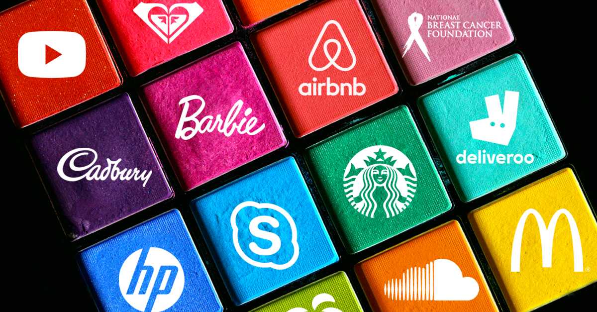
A logo’s colour can say a lot about its brand. Before you roll your eyes as I utter the words ‘colour psychology’, close your eyes and picture the Coca Cola logo. Most likely you will see the logo with its iconic red and be reminded of ads filled with fun and energy.
In the Journal of the Academy of Marketing Science, researchers Lauren Labrecque and George Milne observed that blue is used in over 75% of credit card brand logos, and 20% of fast food brand logos. Meanwhile, red, is used by over 60% of retail brands. This is because blue as a colour is associated with calm and sophistication, it is rational and emits a sense of security. Whereas red is energetic, impulsive, powerful and demands action.
Here are the meanings associated with some of the most common colours:
RED: Passion, Power, Confidence, Energy.
ORANGE: Warmth, Creativity, Optimism, Motivation.
YELLOW: Happiness, Youth, Sunshine, Fun.
GREEN: Fresh, Nature, Growth, Harmony, Health.
BLUE: Loyalty, Security, Wisdom, Serenity.
PURPLE: Regal, Fantasy, Luxury, Mystery.
PINK: Innocence, Femininity, Care, Love.
BLACK/GREY: Modern, Strength, Maturity, Sophisticated.
Colour by association
The vibrancy of the colour also plays a huge part in our psyche. There’s a world of difference between a highlighter-green and an earthy olive-green on a logo. One will make the brand feel alien and artificial while the other is raw and organic. It is important to fine tune the intensity of each colour and make sure it matches with the personality your brand and products or services.

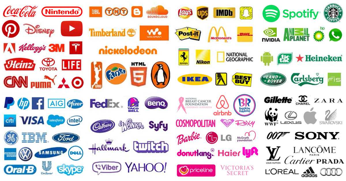
Rarely will you see a logo that is comprised of more than two colours. This is because featuring too many colours in a logo dilutes the overall impact, making the logo look cluttered. That’s why in most cases, multi-colour logos are comprised of a bright colour paired with a neutral colour such as black or grey.
If you are considering bucking the trend by a having a multi-coloured logo, take note that familiar colour combinations will sometimes draw connections to certain visual stereotypes. For example, the combination of green and brown will conjure up the idea of ‘tree’ and the combination of red and green will feel ‘Christmasy’.
The longevity of the logo can also be impacted by its colour. For some industries it is more critical for a business to build trust and be consistent in its branding. They cannot go through a rebrand every 5 years and be swayed by popular trend. In these cases, the logo should opt for colour combinations that are more conventional and not likely to date. Don’t forget that your logo colour(s) will have a life beyond the logo, it will probably appear on your website, product packaging and your business card.
Be memorable and stand out
One of the integral parts of designing a logo is research. Knowing what others are doing within your industry helps you stand out amongst your competitors. Not long ago, we helped a meal-delivery business with their branding. During the research phase we found out that the logos of their local competitors are mostly green or black and white. This streamlined the decision-making process – the colour orange is selected for the logo to maximise its contrast with the other brands, making it more memorable. The warmth and the vibrancy of the colour orange fits in perfectly with the wholesome, home-style cooking that this meal-delivery service wants to convey to its customers. Some of the world’s most iconic brands have its colour trademarked, so competitor brands in their product category have to steer clear of those colours. The Tiffany Blue, the Cadbury Purple and the Target Red to name a few.

To sum it all up, when you’re faced with the colour selection of your logo:
Think about what associations you’d like your customers to make with your brand? What colour(s) will support this? What are my competitors doing with their brand? How can my logo be more memorable and stand out? No colour will guarantee the success of your brand but choosing the wrong colour can send the wrong message to your target audience, causing your brand to be overlooked.
Other Insights

What is Art Direction you ask? Here’s an analogy that will explain the role which Art Direction plays in the realm of advertising and communications (plus it will probably make you hungry at the same time).


Other Resources


We bring branded stories to life; in video, graphics, imagery and copy for advertising, social, digital and print.

Need a trusted strategic partner? We’d love to help you create belonging for your brand.